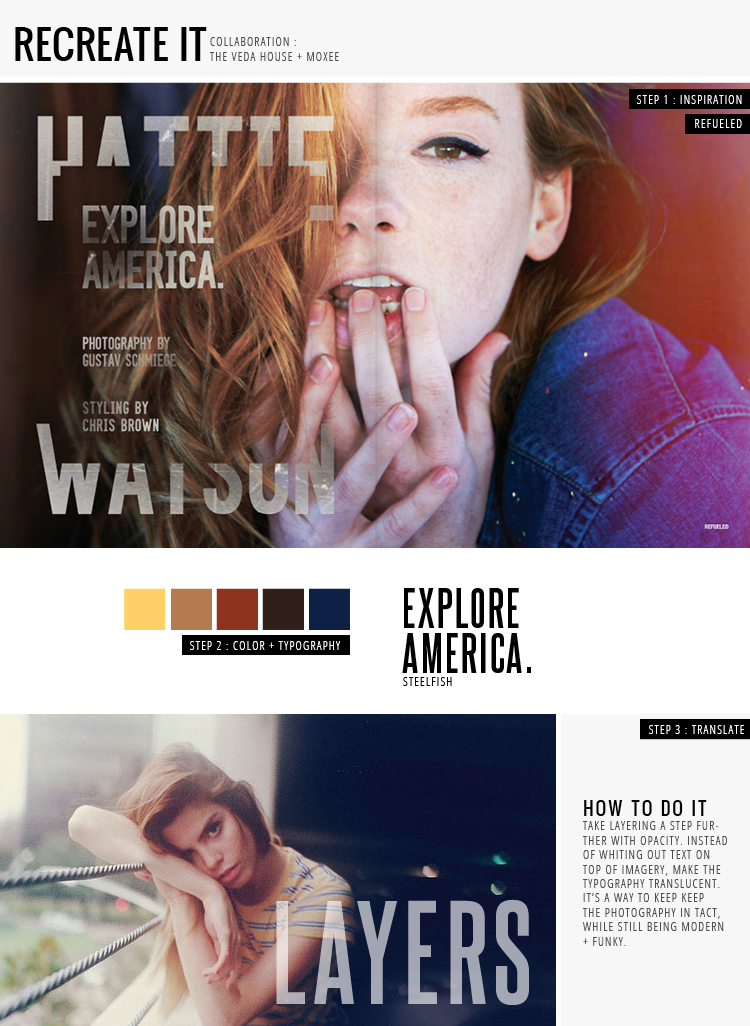
This week’s Recreate It is from the wonderful Refueled Magazine, which has two of my favorite things : full spread photography + justified text ( justification not shown in this post, though ). One thing that Refueled does well is keeping typography cohesive. In their latest issue, any type that is layered on top of a photograph is opaque. Not only that, but they have this cool grunge effect going on. If you’re not 100% sure about whiting out text on top of imagery, just remember that there’s always that translucent option!!
Refueled Magazine / photograph / steelfish font / breanna rose


